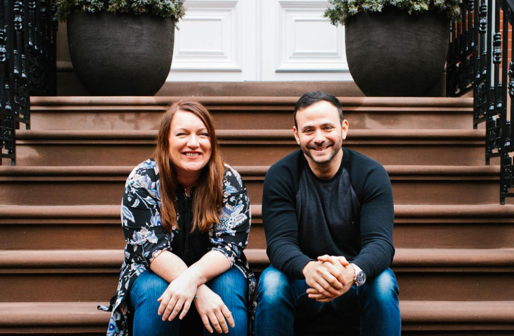
Download All Brand Assets

Logo

The SourceCode logo is a universal signature we use across all our communications. We want it to be instantly recognizable, so consistency is important—please don’t edit, change, distort, recolor, or reconfigure it.

Please use our main logo pictured above when possible. If needed, depending on the background color, you may use the following variation.

Icon

Only use the icon in cases where there’s an established familiarity with the SourceCode brand and/or space is too limited to use the full lockup.

Monochrome Logo

Only use our monochrome logo when necessary. If possible, the monochrome logo should be using one of our brand colors.

Single Color Logo

For the rare cases where colors and transparency are not an option (for example a screenprinting job), you can use this single-color version of our logo.

Logo Spacing

When placing any of the logos inside a container or pairing them with other design elements, make sure to give the logo a comfortable amount of white space to breathe. Use one of the triangles in our icon as a guide for establishing the minimum amount of clear space around the entire logo.

Minimum Size

To ensure the logos preserve their visual impact and legibility in both print and digital formats, do not go any smaller than the minimum size.

Digital

To preserve legibility, do not show the horizontal lockup smaller than 80px wide or the icon smaller than 40px wide when displaying them digitally.

Print

To preserve legibility, do not show the horizontal logo smaller than 1.5” wide or the icon smaller than 0.75”wide when printing them.

Typography

SourceCode uses a combination of Playfair display and Roboto for both web and print.

The font hierarchy should be followed as pictured below.

Colors

The SourceCode color palette features a flexible range of colors, anchored by our primary indigo purple. The color usage should be balanced as follows.


Icons

SourceCode uses line icons.

A full set of icons is available in duotone and single color options and can be found in our brand asset folder. This set of icons can be expanded as needed as long as new icons have the same line weight, colors, and overall look and feel.

Brand Pattern

The SourceCode icon can be used in a pattern as an easily scalable way to create consistent and on-brand visual assets. There are two ways you can use the icon as a graphic element.

1. Grid pattern

Duplicate the icon in a seamless pattern. Use the space between the two brackets as a guide to space all icons.

Example:

1. Cropped and transparent

Depending on the size of your artboard, duplicate, resize and crop the icon once or multiple times at different opacities but using the same scale for each icon istance.

Example:

Stock Photography

SourceCode uses stock photography that follows a few guidelines.

Imagery should always present SourceCode as being forward-thinking, relatable, inclusive, trustworthy, and global. A focus on imagery that highlights SourceCode’s specialties and industries, such as consumer lifestyle, consumer technology, fintech and more, is encouraged. Culture and diversity should also be reflected in SourceCode’s imagery.

Avoid using images that appear overly posed, cliché, cheesy, and inauthentic. Negative and controversial imagery should also be avoided. Avoid using images that are pixelated, low resolution, and low quality.

Examples of lifestyle imagery

Lifestyle imagery can be used to represent both life at SourceCode and the day to day of our clients. Use stock photography that is relatable, inclusive, and casual but professional.

Examples of industry imagery

Industries imagery should focus on technology or an abstract representation of a specific subject-matter.

Examples of imagery to avoid

Team Photos

Team photos are using a gradient map filters. All photos along with a template file are available in the brand asset folder.

Business Card

A business card template using Moo.com’s square card template is available in the brand assets folder.


Email Signature

SourceCode’s email signature should use the following layout. You can create your own signature by copying and pasting the content of the html document included in the brand assets folder in your email client and editing your personal information.


Letterhead

A template for both the SourceCode letterhead and envelope is included in the brand folder.


Zoom Backgrounds

Three Zoom background images are included in the brand asset folder.


Personas

Simply put, user personas are made-up characters based on user data designed to help us better understand our potential client. Personas aid designers to create different designs for different kinds of people and to design for our specific end-user, rather than a generic everybody.

Here are the different personas you should keep in mind while designing or writing for SourceCode.